

User-Centred Design · UX Research · Accessibility · Information Architecture · Website Redesign
/
UX Researcher & Designer
Redesign of the Cumberland House Museum Website
A user-centred UX case study focused on improving clarity, accessibility, and visitor understanding.
OVERVIEW
This project applies a User-Centred Design (UCD) methodology to improve an existing digital experience by grounding design decisions in user research, evidence, and iteration.
Unlike speculative or conceptual work, this case study focuses on real users, real constraints, and measurable usability challenges, demonstrating how research insights translate into practical design decisions.
The homepage presents rich visual content but does not clearly prioritise key visitor tasks such as visit planning or accessibility
Essential visit information is presented in dense text blocks, requiring users to read rather than scan.
Exhibit information is comprehensive but lacks visual grouping and prioritisation, making exploration less intuitive.
1
PROBLEM CONTEXT
Visitors struggled to quickly access essential information and form a clear expectation of the museum experience before visiting.
Information architecture lacked clear hierarchy and prioritisation
Navigation created friction for first-time visitors
Accessibility features were present but not discoverable
2
GOALS & SUCCESS CRITERIA

Goals
Surface critical visit information within 10 seconds
Opening hours, ticket details, and event highlights must be immediately visible on entry.
Design for inclusive readability and accessibility
Improve contrast, typography hierarchy, and discoverability of accessibility tools.
Simplify navigation using visitor-first language
Replace internal terminology with intuitive, action-based labels.
Increase pre-visit engagement through interactive content
Introduce 360° previews, exhibit highlights, and dynamic event discovery.
3
RESEARCH & KEY FINDINGS
To move beyond assumptions, I conducted qualitative and quantitative research to uncover both functional friction and emotional disconnect.
Visitors Perceived the Current Experience as Average — With Design as the Primary Frustration


Users primarily sought practical visit information and clear event discovery.

Hidden assistive features created unintentional barriers to access.
4
EMPATHY & INSIGHT SYNTHESIS
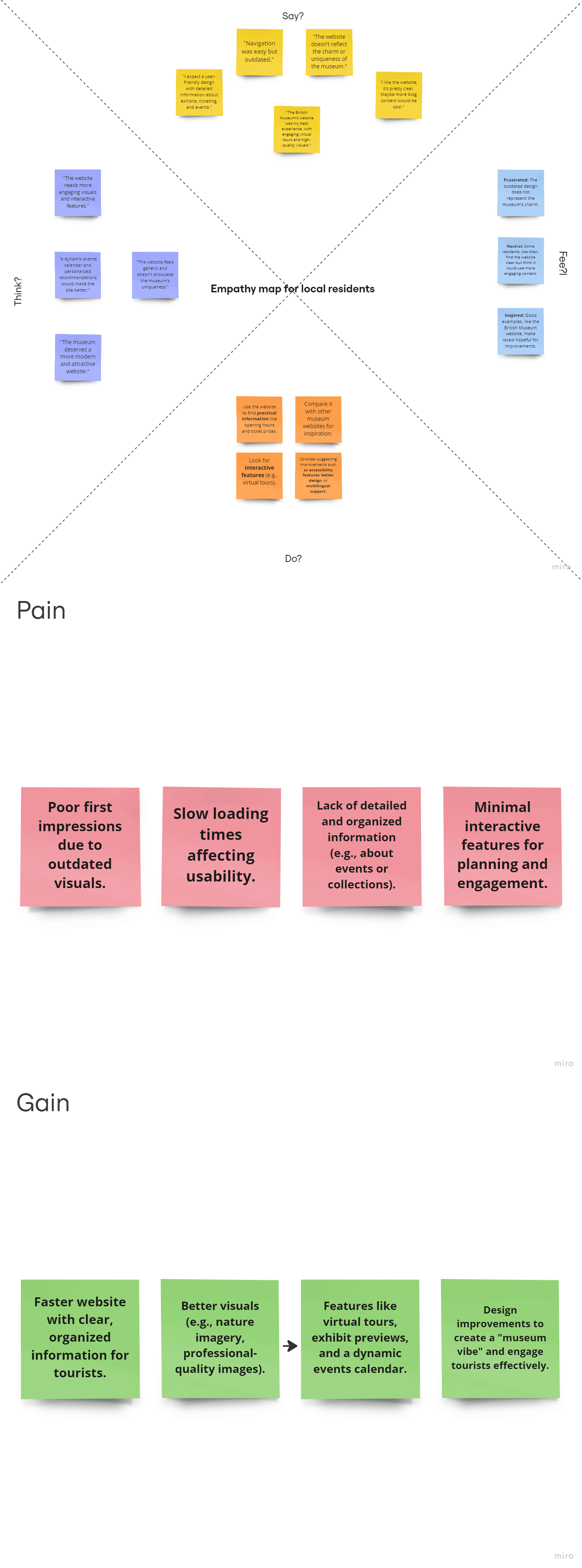
Empathy Insights – Tourist & Local Residents
Empathy mapping revealed uncertainty before visiting, frustration with outdated visuals, and a strong desire for clearer planning tools and interactive previews.
Empathy Insights – Tourist

Empathy Insights – Local Residents
Clustering revealed four dominant themes: hierarchy, navigation clarity, accessibility visibility, and engagement.
Affinity Map

5
DEFINING THE CORE CHALLENGE
The website functioned as a static information source rather than an engaging digital gateway, limiting visitor confidence and emotional connection before arrival.
Visitors need a clear, visually engaging, and accessible platform that enables efficient planning while communicating what makes the museum unique.
6
DESIGN STRATEGY
Insights were translated into strategic design directions focused on clarity, inclusivity, and engagement.
Principle 1 – Clarity Before Creativity
Essential visit information must be visible within the first 10 seconds.
Principle 2 – Visual Storytelling
Highlight exhibits through strong imagery and structured hierarchy.
Principle 3 – Accessibility by Default
Make assistive tools visible, persistent, and intuitive.
Principle 4 – Encourage Exploration
Introduce interactive previews and dynamic event discovery.
7
Low-Fidelity Exploration
Wireframes were developed to refine structure, improve content hierarchy, and simplify navigation before introducing visual styling.
Key Ethical Tensions

Visual hierarchy and grouping were deliberately structured to improve scanability and reduce friction. Through intentional spacing, alignment, and contrast, the layout guides users naturally toward primary actions while maintaining clarity across sections.
Demonstrating Gestalt principles


8
High-Fidelity Design
The final interface introduced strong exhibit highlights, clearer calls to action, visible accessibility controls, and interactive features to create a cohesive digital experience.

HOMEPAGE

FOR VISITORS

What to see and do ?
9
Waleed Sohail Ansari
UX & Visual Designer
Based in the
Open to junior / graduate roles
Let's connect
Exploration Areas
3D & Spatial Experiments
Motion & Kinetic Design
UX Case Studies
© 2026 Waleed Sohail Ansari — Designed & built by me